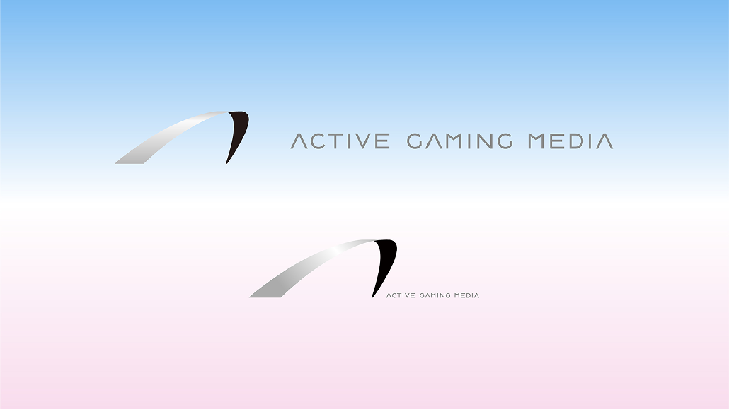
The new logo embodies AGM’s raison d’être: “two-way connection.” It represents the act of unleashing our exceptional content and core essence to the world, while simultaneously deeply incorporating diverse cultures and contexts from around the globe into our organization. We have defined the logo as the nexus where these energies—moving “outward” and “inward”—intersect. The minimalist form, stripped down to its bare essentials, symbolizes a solid identity that remains unwavering even as it takes on the hues of every color (culture). Moving beyond the image of a specific industry, the logo embodies a presence as a “symbol of trust” within a global context.
新しいロゴには、AGMの存在意義である「双方向の接続」が込められています。 自らが持つ優れたコンテンツや本質(Core)を世界へと解き放ち、同時に、世界各地の多様な文化や文脈を内部へと深く取り込んでいく。この「外へ」と「内へ」のエネルギーが交差する結節点として、ロゴを定義しました。極限まで削ぎ落とされたミニマルな造形は、あらゆる色(文化)に染まりながらも、決して揺るがない強固なアイデンティティを象徴。特定の業界イメージを脱却し、グローバルな文脈における「信頼の記号」としての佇まいを持たせています。