At the core of the “OCTLINK” identity is a symbol mark featuring an octopus—the very source of the company’s name.
We have transformed the octopus’s “multi-directional reach” and “adhesive power” into a functional beauty that flexibly yet firmly connects (LINK) the diverse tasks and stakeholders found on construction sites. This logo balances “intelligence”—which simplifies complex site management—with approachability. Its minimalist, geometrically composed lines offer high visibility, ensuring “OCTLINK” is instantly recognizable on helmets, heavy machinery, and smartphone screens, while also embodying the sophistication befitting the next-generation standard in construction management.
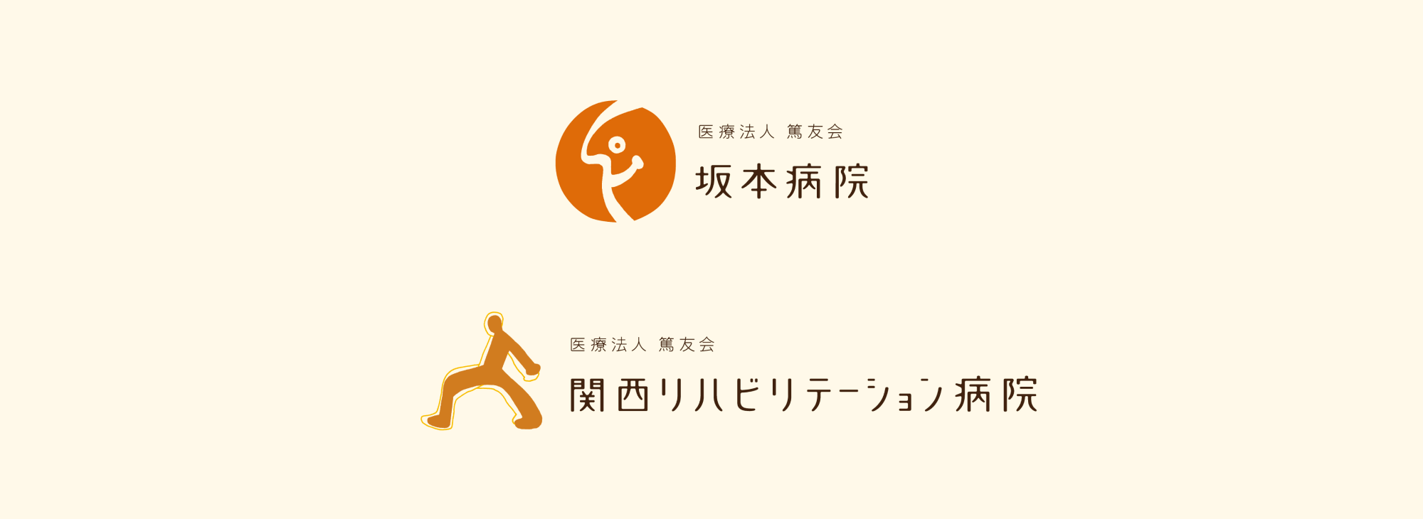
大阪を中心に高度な医療サービスを展開する「医療法人篤友会」傘下の各施設(坂本病院、千里山病院、オーガニッククリニック、関西リハビリテーション病院)におけるトータルブランディング。
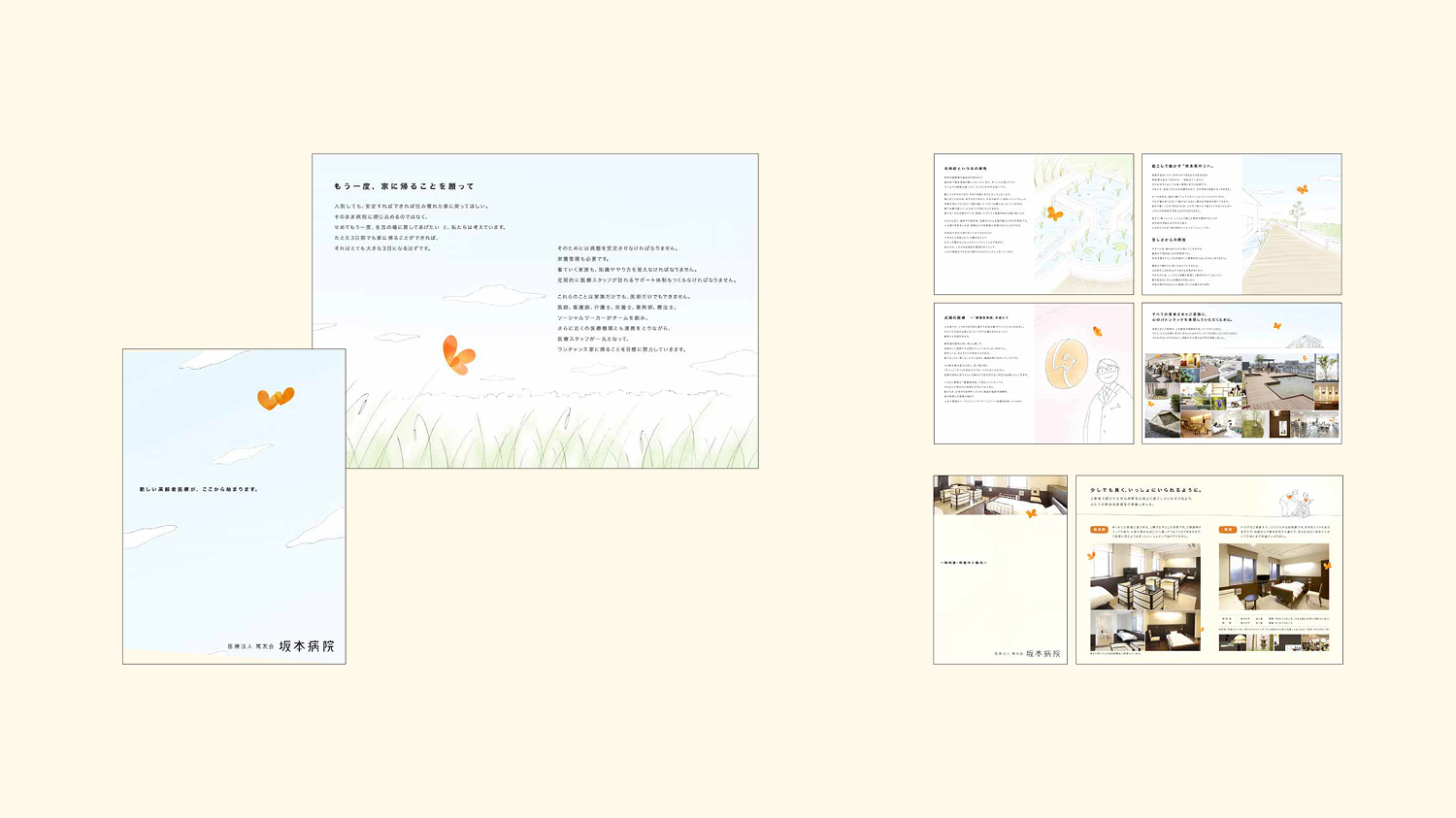
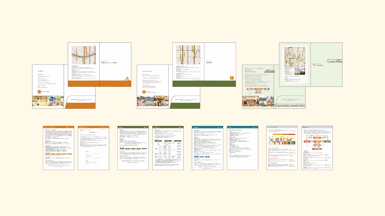
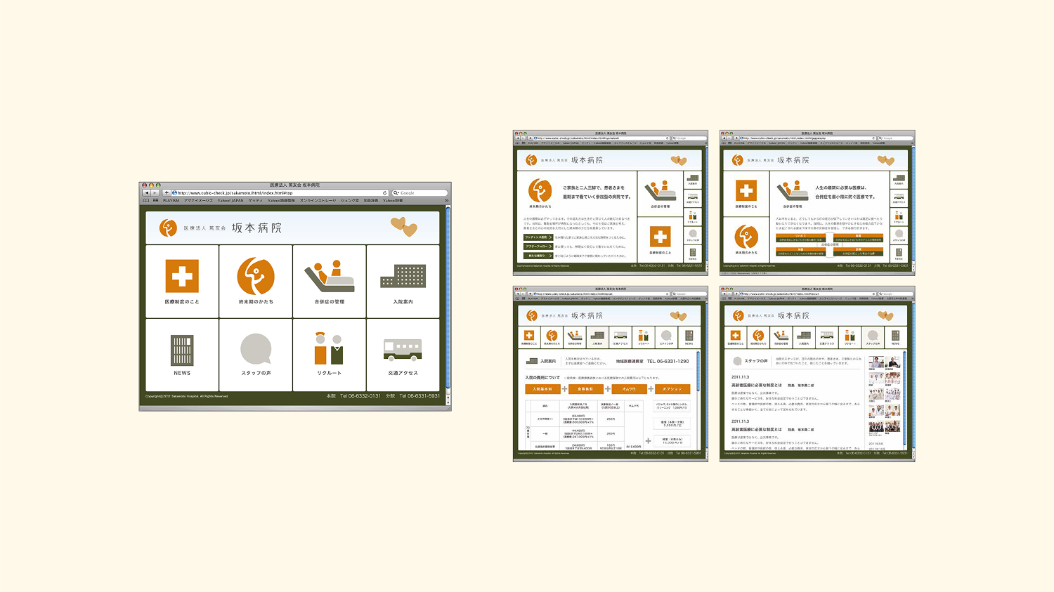
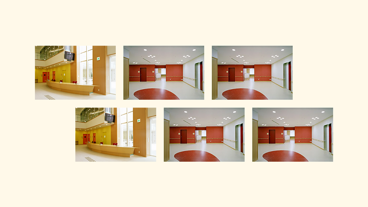
各拠点のロゴ、WEBサイト、パンフレット、販促物の制作に加え、関西リハビリテーション病院では、患者様の快復を支えるカラー設計や院内デザインまでを担当。医療現場に求められる「高度な専門性への信頼」と「心安らぐホスピタリティ」を、一貫したデザインシステムによって具現化しました。