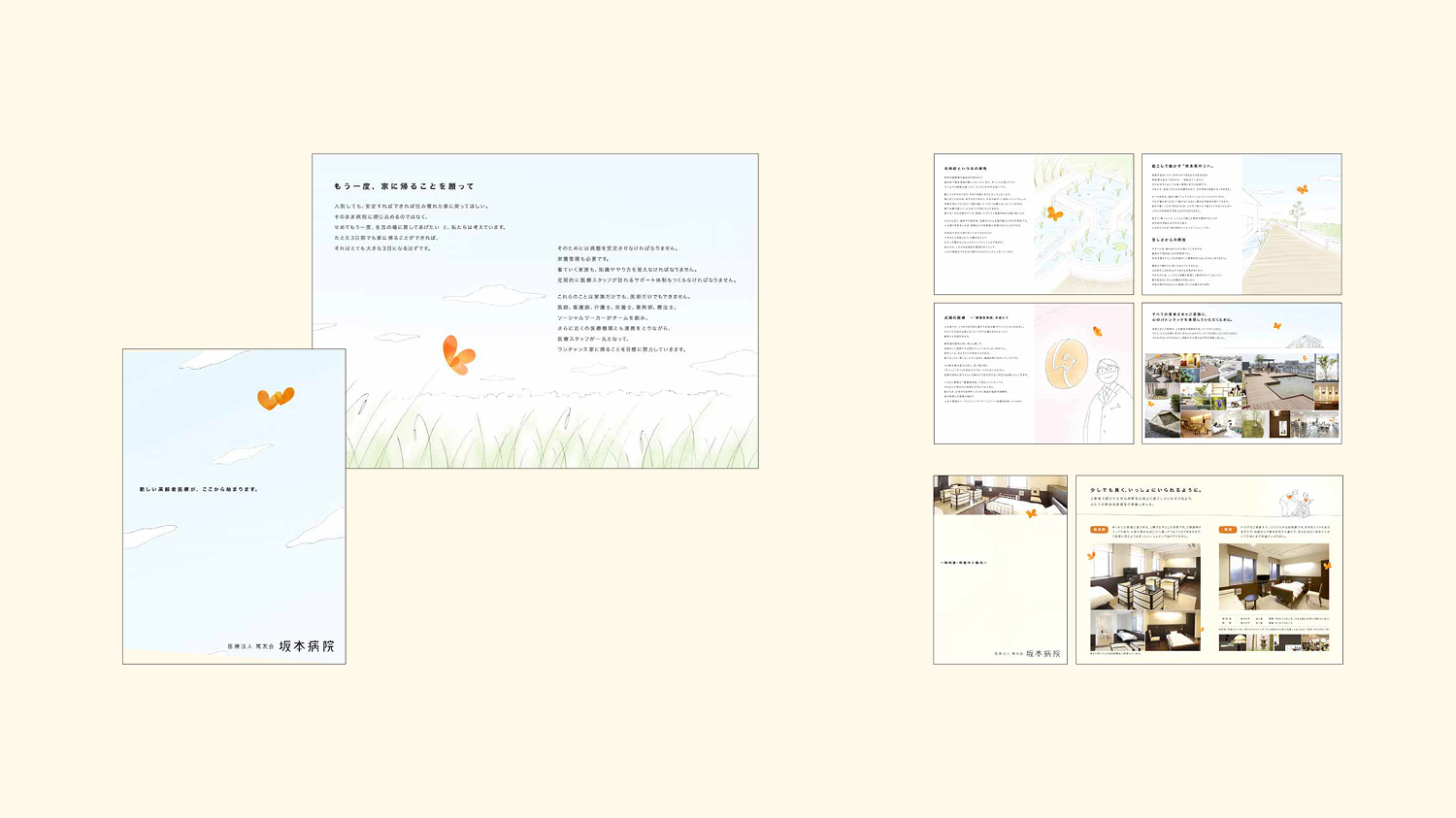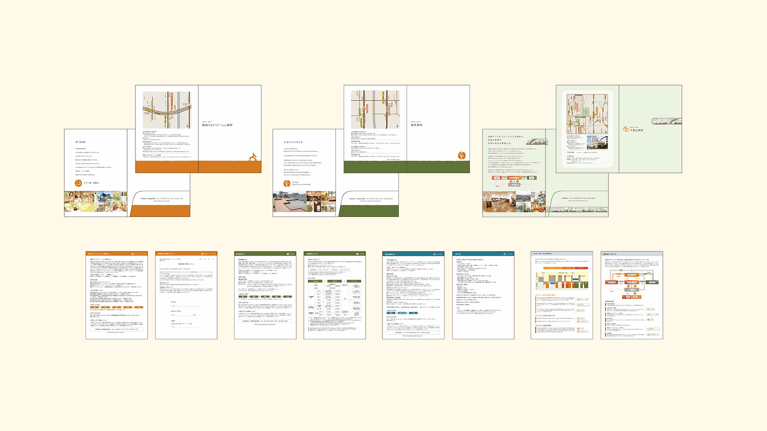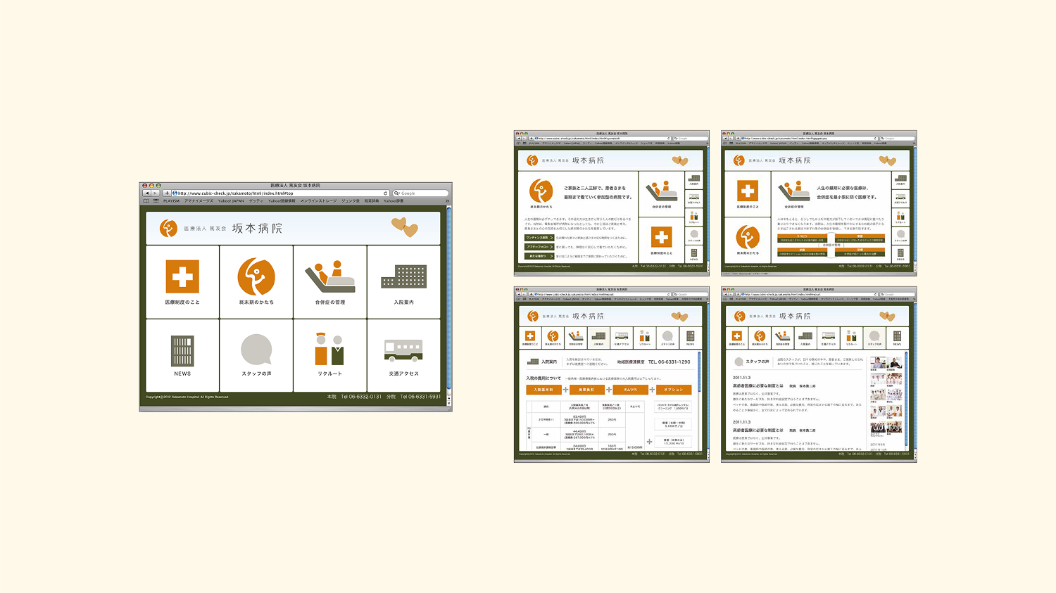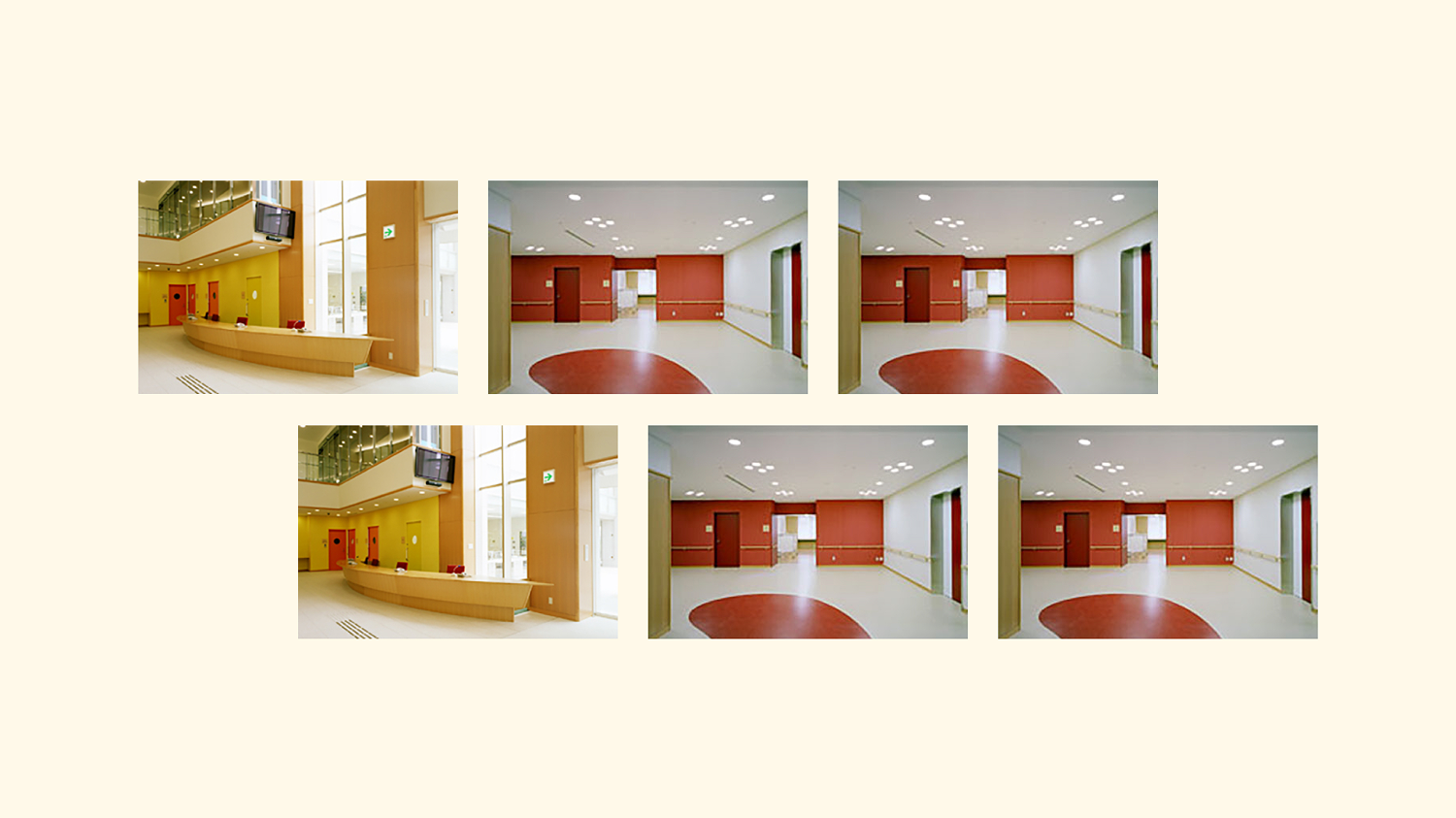
Comprehensive branding for the facilities under the umbrella of “Medical Corporation Tokuyukai,” which provides advanced medical services primarily in the Osaka area (Sakamoto Hospital, Senriyama Hospital, Organic Clinic, and Kansai Rehabilitation Hospital).
In addition to creating logos, websites, brochures, and promotional materials for each location, we were also responsible for the color scheme and interior design at Kansai Rehabilitation Hospital to support patients’ recovery. Through a consistent design system, we embodied the “trust in advanced expertise” and “soothing hospitality” expected in the medical field.