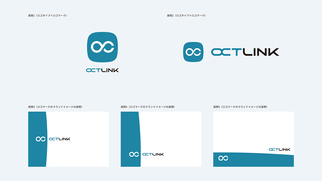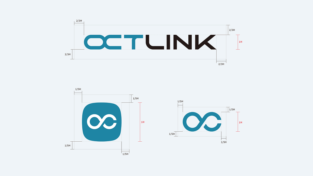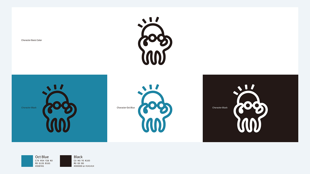
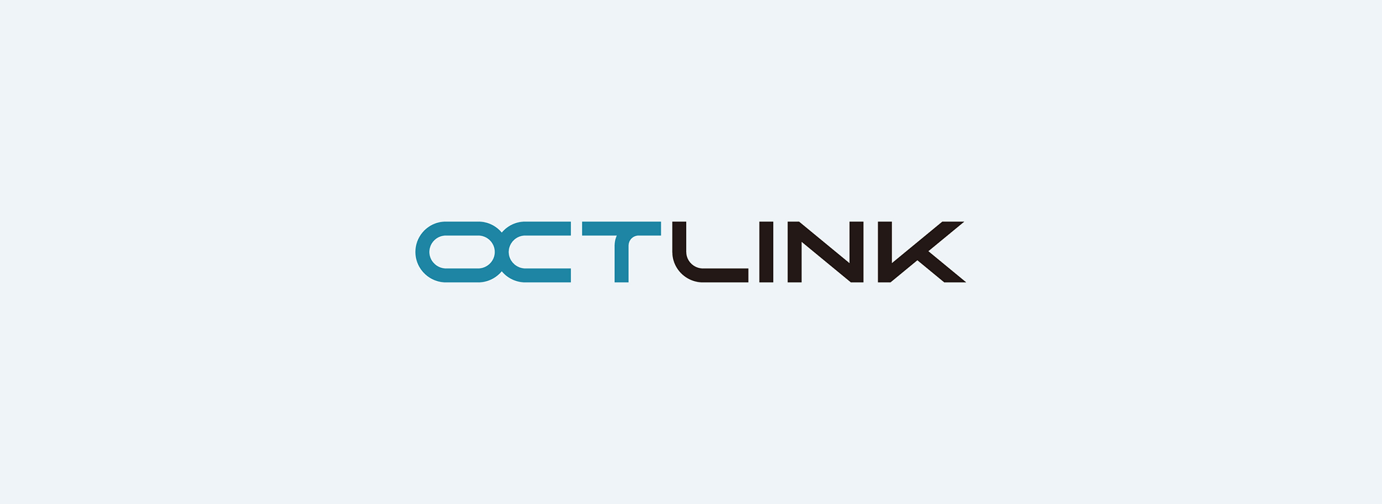
At the core of “OCTLINK’s” identity is a symbol mark featuring an “octopus”—the very source of the company’s name.
We have transformed the “multidirectional reach” and “adhesive power” of an octopus’s tentacles into a functional beauty that flexibly yet firmly connects (LINK) the diverse tasks and stakeholders found on construction sites.
This logo strikes a balance between “intelligence”—which simplifies complex site management—and approachability. Its minimalist, geometrically composed lines offer high visibility, ensuring “OCTLINK” is instantly recognizable even on helmets, heavy machinery, and smartphone screens, while also embodying the sophistication befitting the next-generation standard in construction management.