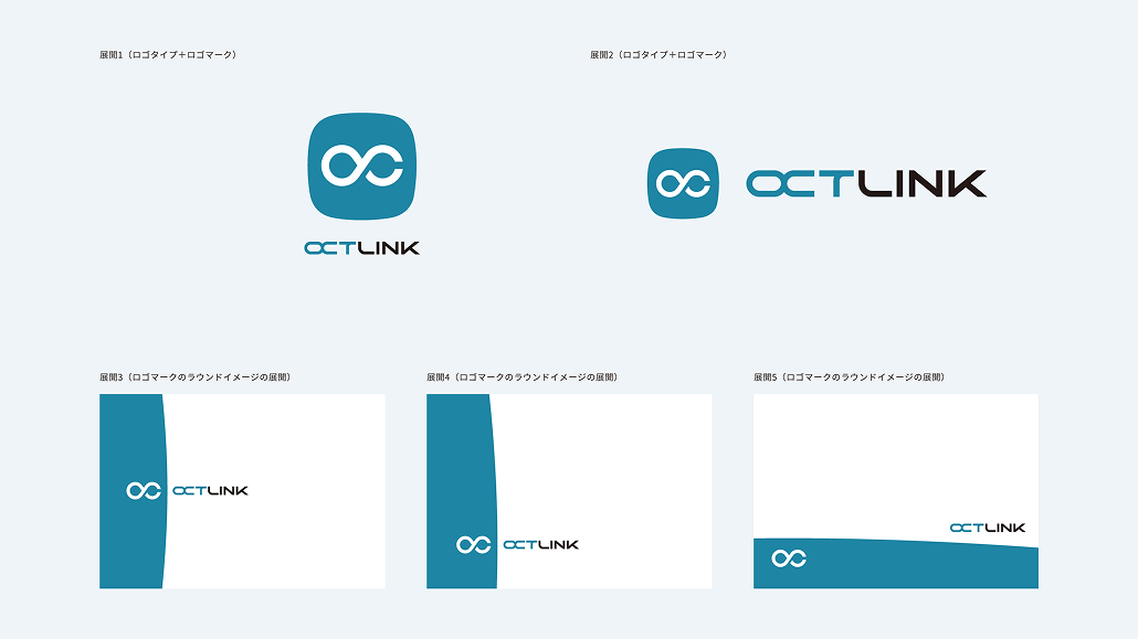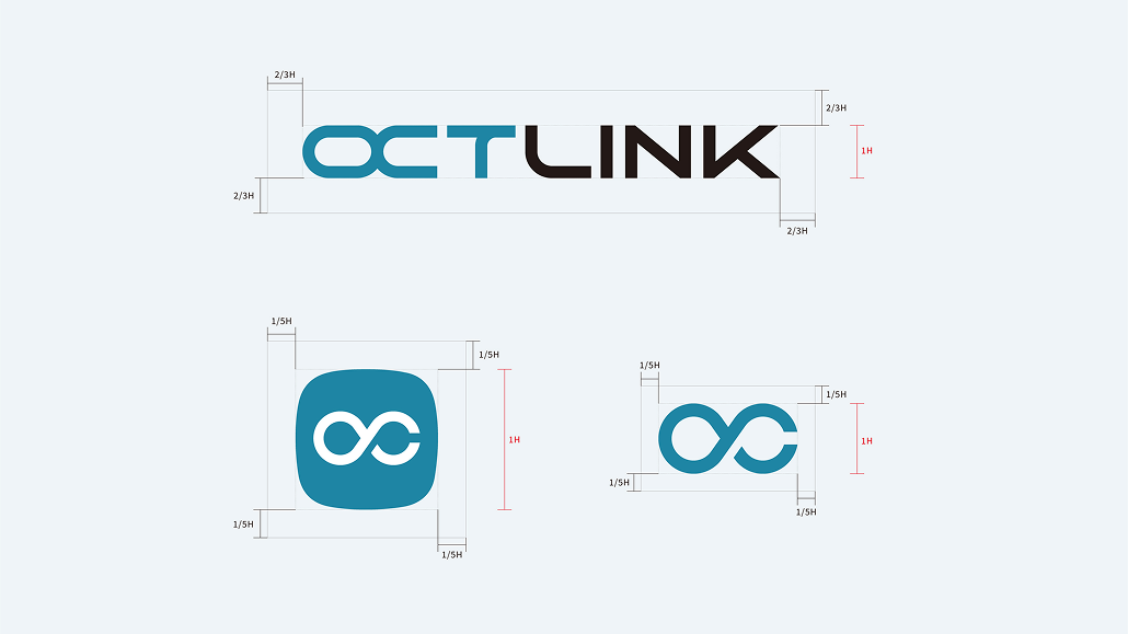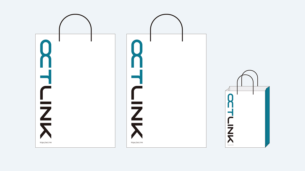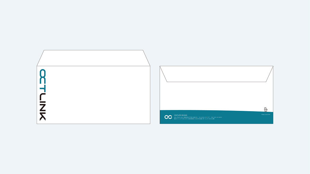
At the core of the “OCTLINK” identity is a symbol mark featuring an octopus—the very source of the company’s name.
We have transformed the octopus’s “multi-directional reach” and “adhesive power” into a functional beauty that flexibly yet firmly connects (LINK) the diverse tasks and stakeholders found on construction sites. This logo balances “intelligence”—which simplifies complex site management—with approachability. Its minimalist, geometrically composed lines offer high visibility, ensuring “OCTLINK” is instantly recognizable on helmets, heavy machinery, and smartphone screens, while also embodying the sophistication befitting the next-generation standard in construction management.
「OCTLINK」のアイデンティティの核となるのは、その名の由来でもある「オクトパス(タコ)」をモチーフにしたシンボルマークです。タコの足が持つ「多方向へのリーチ」と「吸着力」を、建設現場における多種多様なタスクやステークホルダーを柔軟に、かつ強固に繋ぐ(LINK)という機能美へと変換しました。このロゴは、複雑な現場管理をシンプルに解きほぐす「知性」と、親しみやすさを両立させています。幾何学的に構成されたミニマルなラインは、ヘルメットや重機、そしてスマートフォンの画面上でも、一目で「OCTLINK」であると認識できる高い視認性と、次世代の施工管理スタンダードに相応しい格調を兼ね備えています。